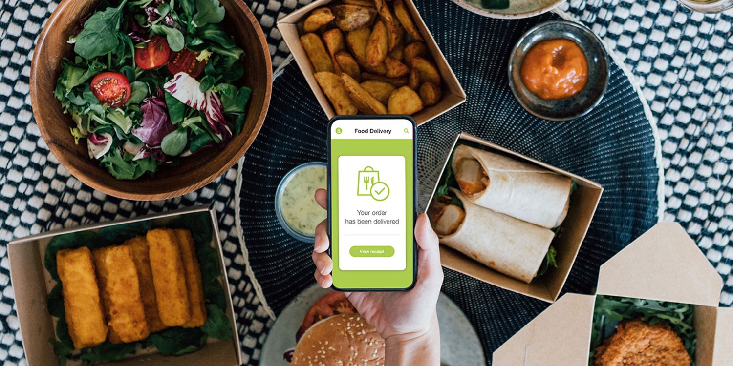
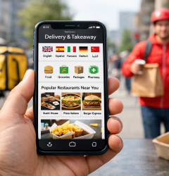
Choosing the right colors for your food delivery app is important. Colors help attract users, make your app easy to use, and build trust. In this blog, we will talk about the best colors that work well for food delivery apps. These colors are popular because they create a good feeling and encourage customers to order food.
Why Colors Matter for Food Delivery Apps
Colors can affect how people feel and behave. For food delivery apps, the right colors can make the app look fresh, fast, and reliable. The wrong colors can confuse users or make the app look old and slow. So, picking the right colors is a smart step when building or updating your app.
1. Red – The Color of Appetite and Action
Red is a strong color that grabs attention quickly. It is often used in food brands because it can increase hunger and excitement. Using red buttons or highlights can encourage users to place orders faster. However, too much red can feel aggressive, so it’s best to use it as an accent color.
2. Green – Freshness and Health
Green is connected with nature, health, and freshness. Many food apps use green to show that their food is fresh or healthy. Green also has a calming effect, which helps users feel good about their choice. Light or soft green tones work well as background colors or in menus.
3. Orange – Friendly and Energetic
Orange combines the energy of red and the cheerfulness of yellow. It is a warm, friendly color that invites users to explore the app. Orange is great for call-to-action buttons like “Order Now” or “Add to Cart” because it stands out without being too loud.
4. Blue – Trust and Reliability
Blue is often linked with trust and safety. Using blue in your app design can make users feel confident about their orders and payments. Light blue tones work well for backgrounds, while darker blues can be used for navigation bars or headers.
5. Yellow – Bright and Happy
Yellow is a bright, happy color that can bring energy and positivity. It works well in small amounts, like icons or badges, to highlight deals or promotions. Be careful with yellow because too much can strain the eyes.
6. Neutral Colors – Balance and Simplicity
Neutral colors like white, gray, and beige are important to balance bright colors. They create clean spaces in the app, making it easier for users to read text and find buttons. Neutral backgrounds also help colorful elements stand out.
7. Combining Colors for the Best User Experience
The best food delivery apps use a mix of colors that balance energy and calmness. For example, red or orange for buttons combined with green or blue backgrounds can create a friendly and trustworthy look. Make sure the colors match your brand message and make the app easy to use.
Choose the Right Colors and Grow Your Food Delivery Business with Zeew
Choosing the right colors is a key step in creating a food delivery app that users enjoy. The colors should match your brand and make ordering simple and pleasant.
If you want to build your own food delivery app without any coding, Zeew is a delivery system made just for you. It lets you customize your app’s colors and design easily to fit your brand style. Plus, you can start for free and launch your delivery service quickly.
With Zeew, creating a professional app with the perfect look is simple — so you can focus on growing your business and serving customers. Start for free.